UI component libraries can get you up and running on a new project pretty fast. However, if you’re building a product that has a bespoke design, trying to customize the look and feel of these libraries is a grueling task and might lead to unmaintainable code.
There are many UI libraries (or, as some call them, UI frameworks) to choose from, and of course, there are different libraries for different front-end frameworks. You might think that coming up on the end of 2023 the industry may have settled on one or two solutions, but it is far from reality.
The truth is, as with anything in software and the web and something that I say often, that it depends…
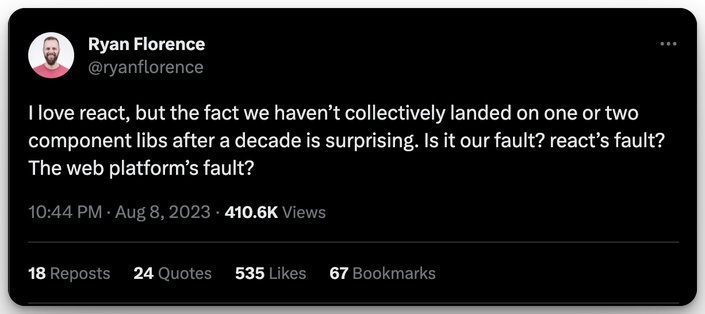
The above tweet (X?) by Ryan Florence got me thinking about this subject – not about who is to blame, because that does no good, but more about the reasons why and how we got into this situation.
In this post, I’m going to give a brief overview of the styling solutions that have led us to the current ecosystem, and we’ll look at some of the more common and popular UI libraries out there.
(Boot) Strap in, we’re going on a ride.
Back in the day, web designers were hand-writing CSS, which, trust me, was a journey full of twists (for more on this, see CSS The Good Parts). Then the 2000s hit, bringing with them CSS frameworks like Blueprint, 960 Grid System, YUI Grids, and YAML (probably not the YAML you’re thinking of). These frameworks introduced responsive grids and clean UI elements, changing the game.
Just when we thought we'd seen it all, giants like Twitter Bootstrap, Foundation, and Bulma entered the scene. They made development quick and ensured consistent styling, but the flip side? Websites began feeling a bit too...uniform.
Recognizing this, the community pivoted, introducing methodologies like BEM to inject some uniqueness and modular style.
Bottom line? CSS frameworks shifted from solely addressing layout needs to offering comprehensive UI toolkits. But alongside this, methodologies emerged, pushing for more tailored and modular styles.
With the emergence of JavaScript frameworks such as Angular, React, and Vue, developers needed a more granular approach to correspond with these new component models.
What is one of CSS’s top features (the “C” in CSS, that is the Cascade) became an issue for these new frameworks.
As such, a new breed of solution was born — CSS in JS. Mostly prevalent in the React ecosystem, libraries such as Styled Components and Emotion allowed scoping styles to components and in so, got rid of the cascade problem.
Tip: Visit our JavaScript hub to learn more.
One key concept that got championed by Web Developer and Designer, Brad Frost, was “atomic design”.
The gist of this concept allows developers and designers to think in this new “componentized” world. The idea is that you should think about a component as a sum of atomic design pieces.
A button, for example, is an atom, a card that holds an image, or some text, and a button - is a molecule. A page, which is consistent with several of these “molecules”, is an organism.
The culmination of the concept has boiled down to CSS frameworks such as Tailwind CSS.
If you want to learn some neat tricks in Tailwind, check out some Tailwind CSS Tips and Tricks Worth Knowing.
You may ask yourself: “Do I really need a UI framework?” The answer might just be NO.
Josh Commeau wrote a very good article on the subject titled: “You don’t need a UI framework”.
Like I’ve said, and I’ll probably keep stating over and over again in any software-related subject - it depends.
Check out “Why Do We Need UI Component Libraries? with Alon Valadji” for a deeper dive.
I once thought that building a design system with Styled Components and Tailwind was the way to go. However, It’s not necessarily the case anymore.
Nowadays, there are many options that might fit your needs, get you started quicker, perhaps avoid the need for a designer at all, or lay a foundation for a complete bespoke design system.
At this point in time, I’d imagine there’d be some sort of Web Component standard that would be usable regardless of your frontend tech stack. However, there’s still no one solution that fits all.
Web Components were initially introduced with the promise of providing a convenient way to create reusable and customizable HTML elements, developed much faster without waiting for the full spec and implementation process.
However, they have faced several challenges that have hindered their widespread adoption in UI development. One of the main issues is the complexity introduced by JavaScript frameworks, which has led to overengineered build processes and dependency graphs.
Additionally, web components have struggled with browser compatibility and standardization. As a result, developers have turned to alternative solutions like React, Angular, and Vue, which offer more straightforward and familiar approaches to building UI components.
Despite the initial promise, web components have not yet become the go-to solution for UI development that they were once envisioned to be.
If we can’t use web components, though, what solutions are available to us?
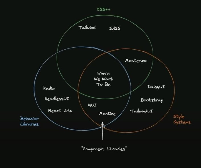
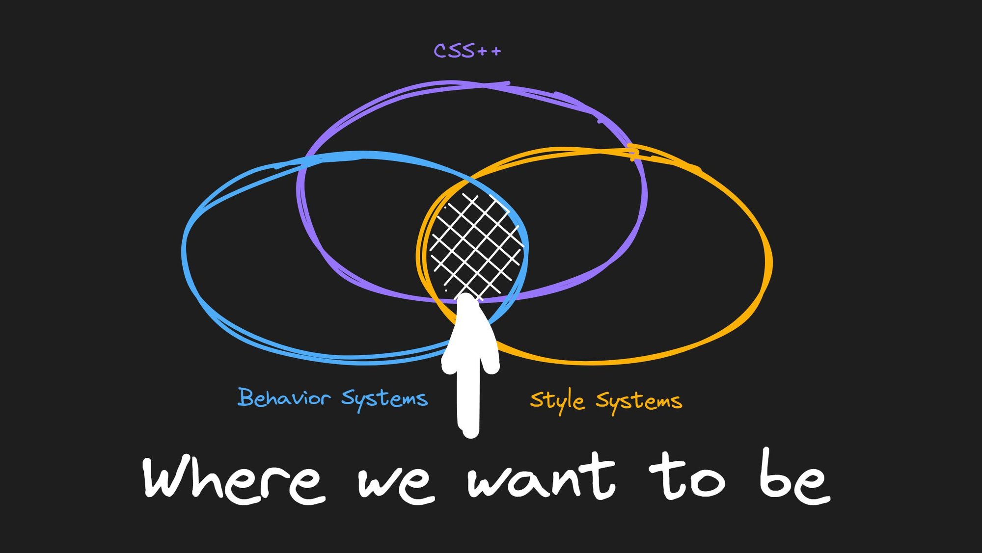
Theo Brown, a known YouTuber and tech influencer, recently broke down the different types of UI libraries in one of his videos. I think he did quite a good job in categorizing these into these types:
- Extensions of CSS: for example, Sass, Less, Tailwind, CSS Modules, to make stuff look a certain way on your own.
- Behavior libraries / Headless: for example, HeadlessUI, Radix, React Aria, for how things behave, not style.
- Style systems: such as, TailwindUI, DaisyUI, for a baked-in look and behavior that is up to the developer.
- Component libraries: for example, MUI, Ant Design, Mantine, are their own thing. You need to learn how to work with them. (ChakraUI, in Theo’s opinion, is a different beast, sitting somewhere close to “where we want to be”.)
Here are some key considerations for what makes a good UI framework:
- Consistency: The framework should provide consistent UI elements, patterns, and behaviors across the application. This helps users quickly understand how to use the interface.
- Flexibility: While being consistent, the framework should also allow for customization and extension to fit the specific needs of different applications. Modular and customizable components are ideal.
- Performance: The framework should be optimized for performance. Things like file size, render speed, and efficiency matter, especially on mobile.
- Accessibility: Following web accessibility guidelines ensures the framework works for all users. ARIA roles, semantic HTML, and keyboard support are examples.
- Documentation: Good documentation and examples make the framework easier to learn and implement. API references, style guides, and code samples help speed development.
- Browser Support: The framework should work across modern browsers and degrade gracefully in older ones. Progressive enhancement principles apply.
- Community: An active community behind the framework provides discussion forums, plugins, and continued maintenance. This helps sustain long-term viability.
- Intuitive: The framework should align with users' mental models and expectations. Leverage natural mappings, consistency, standards, and familiar patterns.
- Responsive: The framework should accommodate diverse screen sizes and input methods. Mobile-first and fluid layouts are best practices here.
In summary, a good UI framework balances consistency and flexibility while optimizing for performance, accessibility, and device support. Great documentation, an active community, and intuitive design are also key. Following established UX principles and heuristics throughout helps ensure quality results.
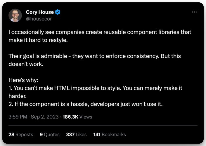
The React ecosystem probably has the most UI libraries out there, due to the size of its ecosystem and popularity. As I am more familiar with this world, the list here is longer than other frameworks and is not by any means a complete list of ALL React component libraries.
Component libraries:
- Material UI: One of the most popular implementations of Google’s Material Design. MUI offers a wide range of components, and theming options, and has been around for ages. With that being said, you are bound by their system.
- Ant Design: A solid option that is been used by a lot of heavy hitters, such as Tencent, Baidu, AliBaba, and more. Supports all modern browsers, SSR, esm, and even Electron. Has also community implementations for Angular, Vue, and more. Does use CSS-in-JS, so expect runtime overhead as well as AntD ways of doing things.
- ChakraUI: An emphasis on A11y, meaning it is fully compatible with the WAI-ARIA accessibility standard, has won OSS awards, and has a thriving community. As mentioned, it’s one of the better choices out there as it has a great model for building composable UI, built-in hooks, and great dark-mode support. This is the same team behind Zag.js, which handles UI as state machines. Once again, you’d need to learn the API, and swapping might be hard to do.
- Mantine: Another fully featured component library with baked in a11y, more than 100 components, and hooks. Mantine is all TypeScript-based and has a way to override default styling. Once more, there’s a lot to learn on how to use its functions and API to achieve your goals.
- Blueprint: A collection of components for building data-intensive interfaces for desktops. It specifically states that it is not designed to work for mobile. It is most likely better for building internal tools, dashboards, and Electron apps. Blueprint is one of the few libs in this list that has a Date Picker component.
- React-Admin: As the name suggests, this component library is targeted at building administrator interfaces for B2B (business-to-business), for example, managing users in your system. It is based on Material design and has a neat feature where you can let it “guess” your list views by providing a sample API endpoint for your data.
- NextUI: Not to be confused with the React meta-framework, Next.js, this library is built on top of Tailwind CSS, and claims to have a minimal learning curve. Themes are handled by your
tailwind.config.jsfile, a11y out of the box, and there’s dark theme support for all components. Overriding styles is done just by putting in different Tailwind class names.
Headless:
- HeadlessUI: The library is only the headless part or behaviors you need to build accessible components. It is specifically designed to integrate with Tailwind, but you could use any CSS solution you like.
- React Aria: A library built by the team at Adobe. It is a full-fledged headless solution that handles behavior, accessibility, and internalization. The API surface of this library is mostly a collection of hooks that you can use (pun intended 😂) to build your components. The pre-defined built components of this lib are currently in alpha.
- RadixUI: Once only a headless component library, the team recently added themes and some styles. The library’s a11y, and composability features are superb, and I myself have had a great experience with working with it. All themes are exposed via CSS custom properties, which can be easily overridden with CSS.
Hybrid approaches:
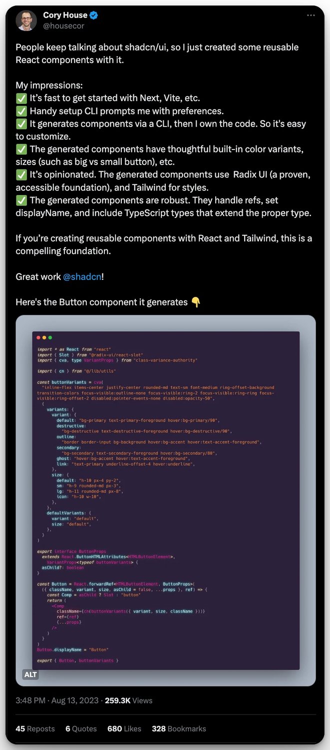
- ShadCN/UI: A new kid on the block, this library takes a different approach than most of the libraries mentioned here. Instead of
npminstalling components or the whole lib and adding it as a dependency, you copy-paste code into your own code base. This is to give you full ownership of the components and separate the design from the implementation. It is built with Tailwind and In order to use this tool, you use the CLI to generate your component code and adjust yourtailwind.config.js. - KumaUI: Another relatively new contender, Kuma uses zero runtime CSS-in-JS to create headless UI components which allows a lot of flexibility. It was heavily inspired by other zero runtime CSS-in-JS solutions such as PandaCSS, Vanilla Extract, and Linaria, as well as by Styled System, ChakraUI, and Native Base.
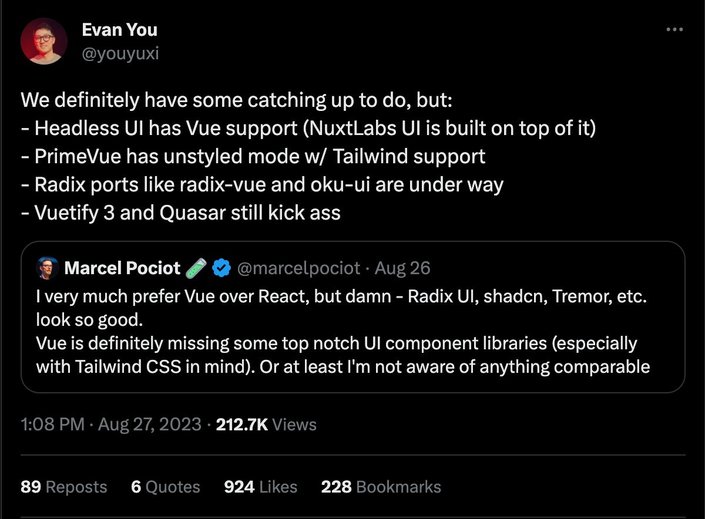
Being someone who’s a bit unfamiliar with the Vue ecosystem, one thing that I noticed is that a lot of the libraries out there have documentation in Chinese and not in English.
I don’t know about you, but my Mandarin is… How’d I put this? Non-existent. Seems like even if a library has excellent docs, you wouldn’t necessarily know it.
Component libraries:
- Quasar: It does not consider itself a library, but more of a framework. That, in my eyes is a bit confusing as it is based on Vue, but the idea is that you can use it to create websites and apps, meaning it uses a CLI to generate different outputs for web, mobile, desktop, SPA (Single Page Apps), SSR (Server Side Rendering), and more.
- Vuetify: Claims to be a no design skills required Open Source UI Library with beautifully handcrafted Vue Components. It has all the bells and whistles like most fully-fledged component libraries. Once more, you’d need to know the API to use this library, as well as get “locked in” to their component composition model.
- Element Plus: As the website states, Element Plus is “a Vue 3-based component library for designers and developers”. Not sure how it differs from the rest of the pack, but it does have about the same variety of components to choose from. It has over 20K stars and over 150K downloads a week, which indicates its popularity.
- VueMaterial: As the name suggests, VueMaterial is a Vue implementation of Material design. The documentation boasts about being simple, lightweight, responsive, with an easy-to-use API. Sounds like all the right things for a component library.
Tip: Visit our Vue and Builder.io Hub
The last time I used Angular in production was about 7 years ago, which is now called Angular.js. However, the framework is starting to have somewhat of a renaissance with signals being introduced and still a whole lot of enterprise companies using it.
Component libraries:
- Angular Material: Like all the rest of the material implementations for the various frameworks. All say about the same about themselves — being high quality, versatile, and frictionless. Whatever superlatives work, I guess 🤷🏽. Watch out for theming and trying to do anything that it doesn’t offer.
- PrimeNG: Something nice about this collection is how you choose the base theme. You are presented with choosing design options that are taken from other popular design frameworks such as Material Design, Bootstrap, Soho, Fluent, Nano, and more. This is done with a visual editor, which is part of the theming options. PrimeNG also has a Figma UI kit, ready-made templates, and a SASS API.
- NG Bootstrap: Yup, just as it sounds, a binding for Angular with Twitter Bootstrap (4.0). The caveat is that you need to learn both the API surface of the lib as well as knowing bootstrap class names.
Tip: Visit our Angular CMS Hub for more related content.
One thing that I really like about Svelte, is the fact that it has a lot of built-ins for handling things like styles and animations. For styling, you simply have a style tag in your component file where your CSS lives and it is scoped only to that component. On top of that, having motion models that can easily handle tween and spring animations is quite great DX.
Headless:
- Svelte Headless UI: A complete port of React Headless UI, which is compatible with SvelteKit (Svelte meta framework). See above for more details.
Component libraries:
- SvelteUI: Yet another TypeScript, fully featured component library. It has over 50 components that are highly customizable. Ranging from layout components, actions, inputs, typography, and all that jazz that you need in a component library.
- Smelte: a UI framework built on top of Svelte and Tailwind CSS using Material Design spec. Plus, it’s a really fun name to say. The gist of it is that the lib has a Rollup plugin that you can define your themes, colors, etc. Then you need to import the libraries CSS and you’re good to go! This library has a Date Picker, navigation drawer and Treeviews, which are rare in most libs.
Tip: Visit our Svelte and Builder.io Hub
SolidJS has been around for a minute and a half, a lot less than most of the above frameworks. I am a fan of Ryan Carniato's work, however I haven't had a chance to work with SolidJS extensively.
It is most definitely a solid (pun intended) contender of choice for your next project.
Thanks to Dave Di Biase for recommending these additions 🙏🏽.
- Kobalte: An unstyled, accessible, and composable UI toolkit for building design system foundations. Inspired by AriaKit, RadixUI, React Araia, and Zag. From rummaging around in their docs, looks a lot like Radix implementation. Note: Still in beta.
- SUID: A port of MUI for SolidJS. As the docs state "same API. Same design", if you're coming from React and have used MUI, this will make you feel at home. Same caveats apply. One cool tool they have is a transformer from React 👉🏽 SolidJS.
- Solid Bootstrap: Once again, as the name suggests, a SolidJS wrapper on top of ye old Bootstrap. The difference being that instead of working with classes for the most parts, you'd need to use props (e.g. `variant`). There's also a "Core" offering which has a headless implementation
Being the newest framework on the list, the Qwik ecosystem is still new. As such, the options here are slim. However, one thing you could do is leverage the React ecosystem inside your Qwik app and use component libraries from there.
There are also other community implementations in the works for Vue, Angular, and Svelte that would open up those ecosystems as well.
Headless:
- QwikUI: Though still in beta, QwikUI offers a headless kit for building fully compatible WAI-ARIA components. Available in beta now are combo boxes, tabs, and accordion.There are drafts for tooltips, selects, and popovers. The team is also working on their own take on ShadCN/UI’s approach codenamed “Fluffy”.
As I’ve mentioned above, web components were meant to be the savior of the frontend world, but have failed to deliver. However, some companies have found success with them when it comes to UI web components. One of these companies is SalesForce with their Lightning Web Components.
Other than that, I’ve only heard of one component library which I think is worth mentioning:
- Shoelace: Being built with web components means this library is framework agnostic, however, React is the only framework that was entitled to get first-class support. It also has built-in localization, and the components were built with Lit. Keep in mind that if you want the get your component content in SSR, this might not fit your needs.
New agnostic libraries that aren’t necessarily built with Web components, but rather with CSS tooling have been popping up lately as well. Here are two interesting newcomers:
- ArkUI: Headless accessible components powered by state machines for React, Vue, and SolidJS. Also made by the creators of Zag.js and Chakra UI, this seems to be the middle ground in between those two offerings.
- Flowbite: Components on top of Tailwind for not only JavaScript frameworks like React, Qwik, Vue, Svelte, Angular, and SolidJS, but also for popular meta frameworks such as Astro, Next.js, Remix, Nuxt, Meteor, and non JS frameworks such as Laravel, Symfony, Ruby on Rails, Pheonix, Django, and Flask.
While on the subject of framework-agnostic solutions, did you know that with Builder’s Headless Visual CMS you can let your designers use your own components inside a drag-and-drop UI?
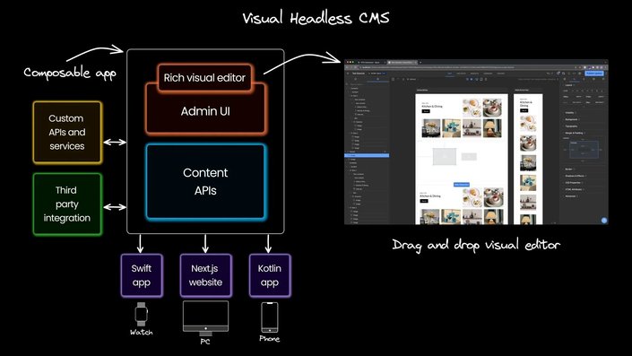
Whatever stack you’re using, with whichever component library, you can register component code that developers have written and use them to compose pages in a visual way.
As can be inferred from this lengthy post, there is an abundance of options to choose from.
Choosing the right solution for you and/or your team can be either a hell of a productivity booster or a huge foot gun.
I myself have experienced the effect of a bad choices that were made. In my case, it was Material UI that made it almost impossible to get the functionality that our product team desired. We had to either completely rewrite components and even use a forked version of MUI, just to get to what we wanted.
Be wary of your choices.
Hopefully, this post has given you a good enough overview of what’s out there now, and got you seriously thinking wether you need a library or wether it’s a good enough investment to roll out your own. Not only for the sake of your product team, but for the sake of your users.
Just remember, your users don’t care what solution you use, like they don’t care if you’re using Tailwind.
Use what is right for what you’re building and the requirements of the project.
Builder.io visually edits code, uses your design system, and sends pull requests.
Builder.io visually edits code, uses your design system, and sends pull requests.


 Connect a Repo


