Personalizing websites is like walking a tightrope. We want Blazing Fast™ performance, deeply personalized end user experiences, and easy management. Sounds simple, right? Well, not quite.
In this post, we'll dive into different personalization approaches, from server-side rendering to edge trimming. We'll look at their pros and cons, and how each balances performance, flexibility, and ease of use.
When it comes to personalization for modern frontend apps, we're aiming for four things:
- Best Possible Performance: We want our page loads to be fast. Like zoom zoom.
- Granular and Flexible Personalization: We want to personalize deeply and flexibly, not just swap out a line of text.
- Easy Creation and Management: We don't want to wrestle with complex systems just to change an image.
- Low Cost: We want to keep our infrastructure and operational costs down.
On top of this, we'll want to support any modern frontend (React, Next.js, Vue, Svelte, Remix, Qwik, etc) and nearly any hosting provider and/or CDN.
Sounds simple enough, right? Well, not quite.
Achieving all four of these goals simultaneously is like trying to nail jelly to a wall. It's tricky, messy, and you'll probably end up with sticky hands. But don't worry, we're going to explore some approaches that can help you find the sweet spot for your needs.
This is like having a personal chef who cooks a fresh meal for you every time you're hungry. Sounds great, but it's not always practical.
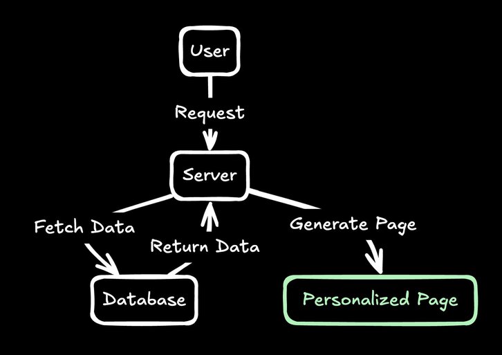
Here's what this might look like in code, for instance in Next.js:
export async function getServerSideProps({ req }) {
  const user = await getUserData(req.cookies.userId);
  const content = await getContent({
    model: 'page',
    userAttributes: { audiences: user.interests }
  });

  return { props: { content } };
}
Server-side rendering for every request is the most straightforward approach to personalization in some ways. Every time a user requests a page, your server springs into action, fetching all the necessary data, and serving up a perfectly tailored page. This gives you ultimate flexibility in personalization.
But here's the catch: it's slow. Every single page view requires a round trip to your server, which has to do work before sending anything back to the user. If your user is in Australia and your server is in the US, that's a long trip for the data to make.
Plus, if your site gets popular, you might find your servers sweating harder than a programmer trying to explain why the project is behind schedule. Needless to say, this can get expensive.
Pros:
- Highly flexible personalization
- Server has full control over the output
Cons:
- Performance can take a hit
- Scaling can be costly
Grading:
- Performance: ⭐⭐ (2/5)
- Flexibility: ⭐⭐⭐⭐⭐ (5/5)
- Ease of Creation/Management: ⭐⭐⭐⭐ (4/5)
- Cost: ⭐ (1/5)
This is like having pre-cooked meals delivered to your door, and then adding your own special sauce before eating.
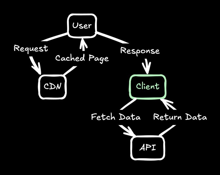
In this case, we will cache the core of the page (any parts that don’t need to be personalized), and fill in the personalized details client side, for instance with a skeleton loader until rendered.
Here's a simplified example of how we can move the personalized bits into the client, for instance with React:
const [contentPromise] = useState(async function() {
  const user = await getUser();
  // fetch the personalized hero for this user
  // e.g. from Builder.io
  const content = await getContent({
    model: 'hero',
    userAttributes: { audiences: user.audiences }
  });
  return content;
})
const content = use(contentPromise)
Edge caching with client-side injection gives you the speed of static content with the flexibility of personalization. You serve a cached, static version of your page from a CDN, which loads fast (literally the fastest way anything can load - CDN to user immediately). Then, JavaScript kicks in and starts fetching personalized content to inject into the page.
This approach is popular because it's relatively easy to implement, works with any frontend and backend stack, and is cost efficient. But it's not all sunshine and rainbows. There's often a noticeable delay between when the page loads and when the personalized content appears, which can lead to a janky user experience.
There's also the SEO problem. Search engines might not see your personalized content because they don't always execute JavaScript. And while the initial page load is fast, you're making additional API calls after the page loads, which can slow down the overall experience.
Pros:
- Fast initial page load
- Works with any tech
Cons:
- Delay between page load and personalized content appearance
- SEO issues
Grading:
- Performance: ⭐⭐⭐ (3/5)
- Flexibility: ⭐⭐⭐⭐ (4/5)
- Ease of Creation/Management: ⭐⭐⭐ (4/5)
- Cost: ⭐⭐⭐⭐ (4/5)
This is like having that personal chef, but they're in a food truck right outside your house.
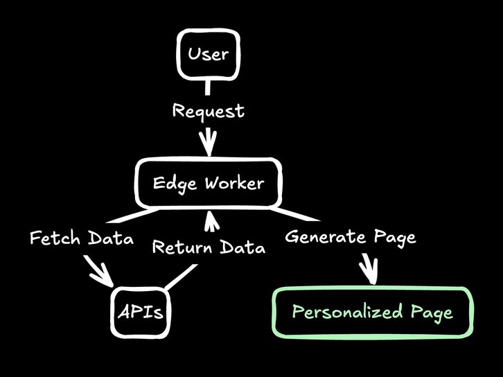
Here's what this might look like using a Remix loader, for instance hosted on Cloudflare’s edge:
async function loader(request) {
  const user = await getUser(request);
  const content = await getContent({
    model: 'page',
    userAttributes: { audiences: user.interests }
  });
  return content;
}
Edge rendering brings computation closer to the user, reducing latency and improving performance. Instead of your request traveling halfway around the world to reach a central server, it only needs to go to the nearest edge location. This approach is similar to server side rendering per request but with some performance improvements.
But it's not all smooth sailing. One of the biggest challenges is data availability. Not all of your data might be easily accessible at the edge, which might require additional round trips across the world to various sources of data before a response can be fully sent. Edge computing environments also often have limitations that can make development more complex.
Despite these challenges, edge rendering can be powerful for many use cases. It's like having a food truck with a gourmet chef – great if you need it, but maybe too much if you're just serving hot dogs.
Pros:
- Faster than traditional server rendering
- Can still provide highly personalized content
Cons:
- Not all data is available at the edge
- Can get complex with streaming and such
Grading:
- Performance: ⭐⭐⭐ (3/5)
- Flexibility: ⭐⭐⭐⭐ (4/5)
- Ease of Creation/Management: ⭐⭐⭐ (3/5)
- Cost: ⭐⭐⭐ (3/5)
This is like ordering a standard meal but having the delivery person add a personalized garnish before they hand it to you.
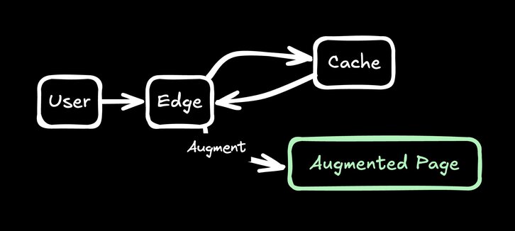
In this world, we respond with cached content but swap in some dynamic parts as needed at the edge.
async function handleRequest(request) {
  const [html, user] = await Promise.all([
    getHtml(request), getUser(request)
  ]);

  // Swap out special strings with personalized info
  return html.replace('%%USER_NAME%%', user.name)
}
Edge augmentation is a middle ground between serving entirely static content and generating fully personalized pages for each request. You start with a pre-generated page that's cached at the edge, then make small, targeted modifications based on user data before sending it to the browser.
The beauty of this approach is that you get the performance benefits of serving cached content, but you still have the ability to add personalized touches. It's particularly well-suited for things like injecting a user's name, swapping out a hero image based on location, or other very surgical operations.
However, it's important to note that edge augmentation is not a replacement for full server-side rendering. The personalizations you can make are highly limited in scope. You're working with an existing HTML structure, so making sweeping changes to the layout or content structure can be challenging.
Pros:
- Fast response times
- Allows for some personalization
Cons:
- Limited in the scope of personalizations
- Can be tricky to implement for complex changes
Grading:
- Performance: ⭐⭐⭐⭐⭐ (5/5)
- Flexibility: ⭐⭐⭐ (3/5)
- Ease of Creation/Management: ⭐⭐ (2/5)
- Cost: ⭐⭐⭐⭐ (4/5)
This is like having a few different pre-prepared meals and choosing which one to serve based on what you know about the diner.
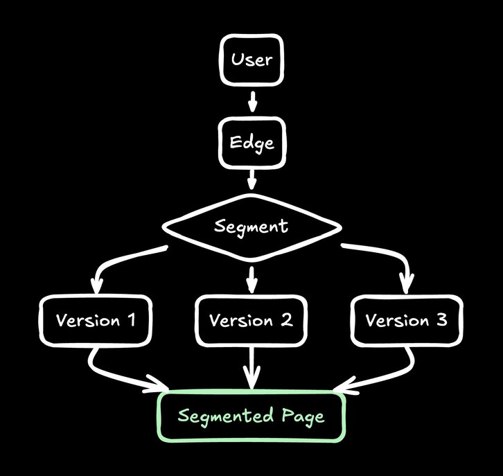
In this approach we will redirect users based on their attributes to a finite set of segments.
async function handleRequest(request) {
  if (!request.url.searchParams.has('segment')) {
    const userSegment = getUserSegment(request)
    const newURL = new URL(request.url)
    newUrl.searchParams.set('segment', userSegment)
    redirect(newUrl)
  }
  // serve the content for this segment, e.g. at ?segment=...
}
Segmentation at the edge works by determining which segment a user belongs to and then serving them a pre-generated version of the page tailored to that segment. These pages could be generated statically or just be simple server side rendered pages using stale-while-revalidate caching (e.g. Cache-Control: stale-while-revalidate=...)
This allows for more significant personalizations than edge augmentation, while still maintaining excellent performance.
However, you're limited to a fixed number of segments. You can't have an infinite number of variations, or you lose the benefits of caching. This means you need to carefully choose your segments to ensure you're covering your most important use cases without creating too many variations.
Despite these challenges, segmentation at the edge can be a powerful approach for many websites. It's particularly well-suited for cases where you have clear, distinct user groups with different needs (for instance - an ecommerce site with known menswear shoppers, womenswear shoppers, or unknown/anonymous).
It's a bit like running a restaurant where you have a few set menus designed for different types of diners.
Pros:
- Fast response times
- Allows for more significant personalizations
Cons:
- Limited to a fixed number of segments
- Requires careful planning of segments
Grading:
- Performance: ⭐⭐⭐⭐⭐ (5/5)
- Flexibility: ⭐⭐⭐ (3/5)
- Ease of Creation/Management: ⭐⭐⭐ (3/5)
- Cost: ⭐⭐⭐⭐ (4/5)
This is like giving the diner a menu with all the options, but having a waiter who knows their preferences and points out the dishes they're most likely to enjoy.
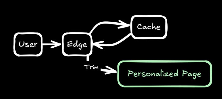
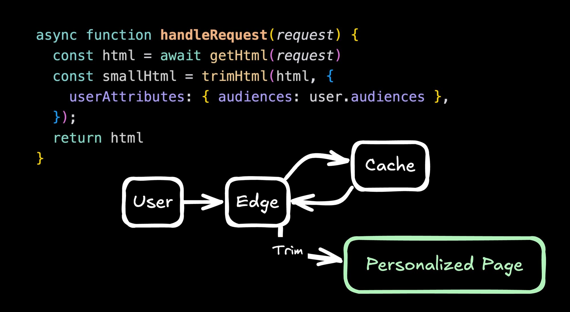
Edge-Trim Personalization serves a single HTML file containing all content variations, which can be aggressively cached at the edge. Then, at the edge, you process this HTML to show only the relevant content for that specific user before sending it to the browser.
async function handleRequest(request) {
  const html = await getHtml(request)
  const smallHtml = trimHtml(html, {
    userAttributes: { audiences: user.audiences },
  });
  return html
}
This approach allows for incredibly granular personalization and is great for SEO because all the content is in the initial HTML. This approach even can work without an edge worker too. Platforms like Builder.io use inline scripts as a fallback that swaps the content on the client that best match the given user, instantly while the page is rendering.
I find this approach to be incredibly powerful. It works well with visual editing tools and provides a lot of flexibility. It's like having a restaurant where the menu includes every possible dish, but each diner only sees the dishes that are relevant to them.
One of the key strengths of this approach is it works even without an edge worker to trim HTML. By default the HTML is saved with inline scripts that executes the personalization synchronously on the client, like:
<div class="hero">
  <h1 class="title">Hello there</h1>
  <script>
    if (userAttributes.segments.includes('returnVisitor')) {
      document.currentScript.previousElementSibling.textContent = 'Welcome back!'
     }
  </script>
</div>
Given this, no CDN is necessary, and due to the nature of gzip, you can have a large amount of personalizations with a small (for instance 5-10%) payload increase. But in the case of using the CDN to trim, if you are in the returnVisitor user segment, you would just get:
<div class="hero">
  <h1 class="title">Welcome back!</h1>
</div>
The main downside of this approach is that it requires special tooling that can generate this code across modern frameworks (accounting for correct hydration, etc). Platforms like Builder.io support this and give a visual editor to make edits visually or with natural language.
Example of using Builder.io to personalize parts of a page with natural language
But, rolling this your own can be a bit complex and perhaps best to use one of the other options.
Pros:
- Optimal caching
- Allows for highly granular personalization
- Flexible personalization at the edge
- SEO-friendly
Cons:
- Requires special tooling and not the easiest to roll your own
Grading:
- Performance: ⭐⭐⭐⭐⭐ (5/5)
- Flexibility: ⭐⭐⭐⭐⭐ (5/5)
- Ease of Creation/Management: ⭐⭐⭐⭐⭐ (5/5)
- Cost: ⭐⭐⭐⭐ (4/5)
So, what's the best approach? As with most things in tech, it depends on your specific use case. But here's my general recommendation:
- Start with edge caching. It's the foundation of good performance.
- For below-the-fold content or non-critical personalizations, consider client-side fetching, especially for things that need 1:1 personalization such as per-user recommended products.
- Consider edge segmentation if you have well-defined user segments and don't need super granular personalization.
- For a best of all worlds approach, look into platforms like Builder.io that gives you the developer and end-user tooling to implement edge-trim personalization effectively, as well as every other option covered here.
Remember, the goal is to provide a personalized experience without sacrificing performance, flexibility, ease of management, or cost. It's a balancing act, but with these tools in your toolkit, you're well-equipped to handle it.
Here's a quick summary of how each approach stacks up:
| Approach | Performance | Flexibility | Ease of Use | Cost |
|---|---|---|---|---|
| Server-Side Rendering | ⭐⭐ | ⭐⭐⭐⭐⭐ | ⭐⭐⭐ | ⭐ |
| Edge Caching + Client-Side | ⭐⭐⭐⭐ | ⭐⭐⭐⭐ | ⭐⭐⭐ | ⭐⭐⭐⭐ |
| Edge Rendering | ⭐⭐⭐ | ⭐⭐⭐⭐⭐ | ⭐⭐ | ⭐⭐ |
| Edge Augmentation | ⭐⭐⭐⭐⭐ | ⭐⭐ | ⭐⭐ | ⭐⭐⭐⭐ |
| Segmentation at the Edge | ⭐⭐⭐⭐⭐ | ⭐⭐⭐ | ⭐⭐⭐ | ⭐⭐⭐⭐ |
| Edge-Trim Personalization | ⭐⭐⭐⭐⭐ | ⭐⭐⭐⭐⭐ | ⭐⭐⭐⭐⭐ | ⭐⭐⭐⭐ |
As you can see, Edge-Trim Personalization offers a great balance across all four criteria, which is why it's my personal favorite and why, while we support all of the above approaches with Builder.io’s personalization features, I push people to consider Edge-Trim personalization most.
However, the best approach for you will depend on your specific needs, resources, and constraints.
Personalization is a powerful tool, but it needs to be wielded carefully. By understanding these different approaches, you can choose the right strategy for your specific needs.
Keep in mind:
- Performance is key. Don't sacrifice it for personalization.
- Caching is your friend. Use it wisely.
- Be flexible. Different parts of your site might benefit from different approaches.
- Start small and iterate.
- Always keep your users in mind.
- Consider the cost implications of your chosen approach.
The world of web personalization is constantly evolving. New techniques and technologies are emerging all the time, pushing the boundaries of what's possible. Stay curious, keep learning, and don't be afraid to experiment.
Remember, the goal of personalization isn't just to show different content to different users. It's to create experiences that resonate, that feel tailored and relevant. When done right, personalization can make your users feel understood and valued. And that's pretty cool.
If you want a deep dive on what personalization approach is best for you, talk to our team.
Builder.io visually edits code, uses your design system, and sends pull requests.
Builder.io visually edits code, uses your design system, and sends pull requests.


 Connect a Repo


