React component libraries save you from rebuilding buttons, modals, and forms from scratch, but choosing the wrong one costs weeks in migration pain. To make the right call, you need to know when to use styled components versus headless primitives and how to match a library to your stack and design constraints.
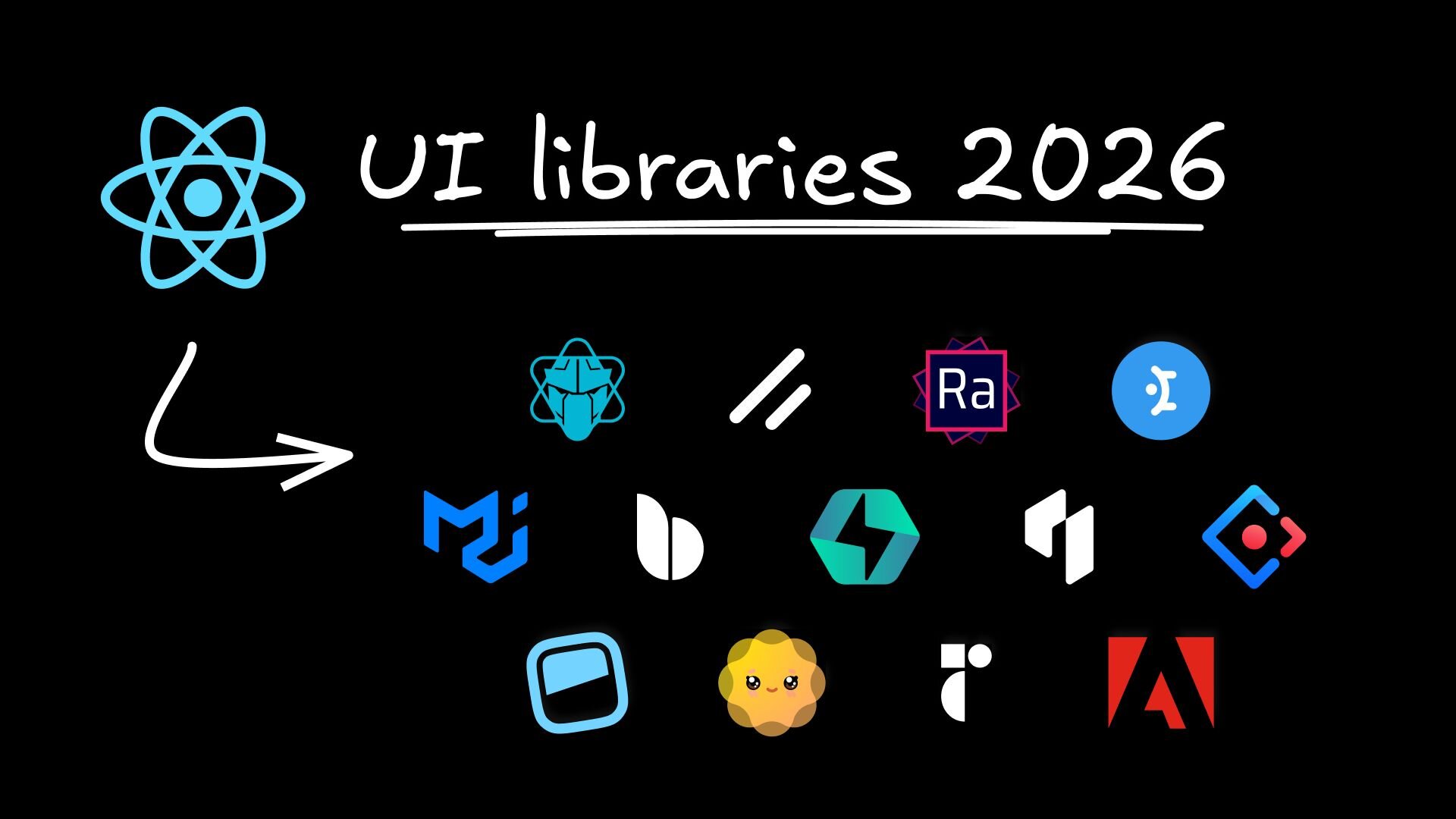
This guide breaks down 15 battle-tested libraries across different use cases, from comprehensive design systems like Material UI to unstyled primitives like Radix, so you can pick the one that fits your team's needs and constraints.
A React component library is a collection of pre-built UI pieces like buttons, forms, and navigation bars that you can drop into your app. Instead of coding every button from scratch, you import a tested, styled button component and use it wherever you need one.
Think of it like a toolbox for building interfaces. You get consistent, reusable pieces that work together, so your app looks cohesive and your team moves faster.
Building every UI element from scratch wastes time (47% longer than using design systems) and creates inconsistency. When five developers build five different buttons, users notice the chaos. Component libraries solve this by giving everyone the same building blocks.
Production apps need more than pretty interfaces. They need accessibility for users with disabilities (96% of top websites have accessibility errors), performance optimization for fast loading, and maintainable code that won't break when you update it. Quality libraries handle these concerns so you don't have to become an expert in every aspect of UI development.
Not all libraries are created equal. Some look great in demos but fall apart in real applications. You need to evaluate them based on what actually matters for your project.
Key evaluation criteria:
- Design system fit: How much work will it take to match your brand? Look for robust theming that uses design tokens for colors, spacing, and fonts.
- Developer experience: Clear documentation with working examples. Strong TypeScript support for better autocomplete and error catching.
- Performance impact: Bundle size matters for loading speed. Check if the library supports tree-shaking to eliminate unused code.
- Accessibility built-in: WCAG compliance, keyboard navigation, and screen reader support should come standard.
- Active maintenance: Recent updates, responsive issue resolution, and a clear roadmap indicate a healthy project.
These libraries offer complete design systems with consistent visual languages and extensive component coverage. They work well when you need a professional interface without building everything from the ground up.
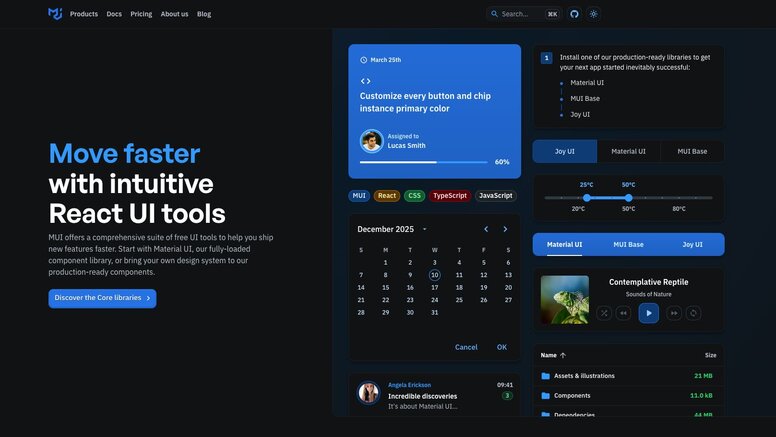
Material UI implements Google's Material Design in React. You get Google's design philosophy built into every component, from buttons to complex data tables. It's one of the most popular React libraries because it covers almost every UI pattern you'll need.
The ecosystem is massive. MUI X provides advanced components like data grids and date pickers for complex applications. The documentation is thorough, and the community support is strong.
The trade-off is bundle size and design opinions. Material Design has a specific look that might not fit every brand. But if you need a comprehensive, battle-tested solution, MUI delivers.
Ant Design targets enterprise applications with rich, data-heavy interfaces. The components are designed for dashboards, admin panels, and business tools rather than consumer-facing websites.
It excels at complex forms, data visualization, and information-dense layouts. The design language is clean and professional, with strong TypeScript support throughout. Built-in form validation and data handling reduce the need for additional libraries.
The downside is its distinct aesthetic. Ant Design looks like Ant Design, and customizing it to match a different brand requires significant effort.
Chakra UI prioritizes developer experience and accessibility. The APIs are intuitive, letting you style components with props like bg="blue.500" and p={4} for padding.
The modular approach lets you import only what you need. Built-in dark mode support and responsive design props make common tasks simple. The accessibility features work out of the box without extra configuration.
Chakra strikes a balance between flexibility and convenience. It's modern, well-documented, and growing rapidly in adoption.
Tailwind CSS changed how developers think about styling with its utility-first approach. These libraries work with Tailwind, giving you component logic while preserving the utility class workflow you're used to.
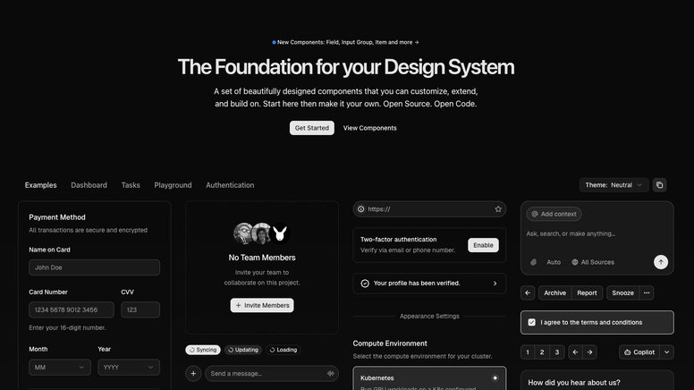
shadcn/ui isn't installed like a normal library. Instead, you copy and paste component code directly into your project. This gives you complete ownership and control over every line of code.
Built on Radix UI and Base UI primitives with Tailwind CSS styling, it provides beautiful, accessible components that you can modify without fighting against library constraints. The copy-paste approach means no dependency management and no version conflicts.
For teams that value control and customization, this approach is liberating.
Created by the Tailwind team, Headless UI provides component behavior without any styling. You get all the complex logic for dropdowns, modals, and tabs, but you style them entirely with Tailwind classes.
It's a natural companion to Tailwind CSS. You handle the visual design while Headless UI manages accessibility, keyboard navigation, and state management. The components are thoroughly tested and follow web standards.
daisyUI adds semantic component classes to Tailwind CSS. Instead of writing bg-blue-500 text-white px-4 py-2 rounded, you write btn btn-primary. This reduces markup verbosity while keeping Tailwind's utility-first philosophy.
It comes with multiple themes and supports CSS variables for customization. You still have access to all Tailwind utilities when you need them, but common patterns become much cleaner.
Unstyled libraries provide functionality without visual opinions. You get state management, accessibility, and complex interactions, but you handle all the styling. These work well for teams with established design systems.
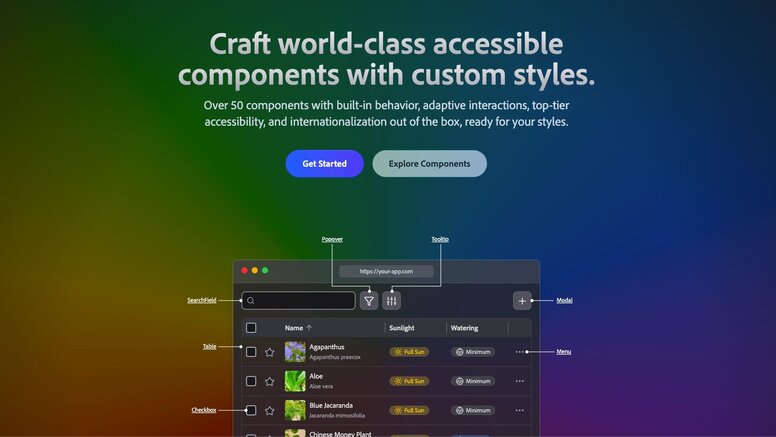
Adobe's React Aria Components handles the hardest parts of building accessible interfaces. You get proper keyboard navigation, screen reader announcements, and internationalization support for complex components like date pickers and combo boxes.
The library manages focus, ARIA attributes, and interaction states so you don't have to become an accessibility expert. You focus on styling while React Aria ensures your components work for everyone.
Radix UI provides low-level primitives for building design systems. You get basic building blocks like Dialog, Dropdown, and Tooltip that you can compose into more complex components.
Many popular libraries, including shadcn/ui, are built on Radix primitives. Using Radix directly gives you maximum flexibility and control over your component architecture.
Base UI comes from the creators of Radix, Material UI, and Floating UI. It provides unstyled React components with a focus on accessibility, performance, and developer experience.
The library includes a comprehensive set of components like Accordion, Dialog, Menu, and Toast. Each component follows WAI-ARIA design patterns and is tested across a wide range of browsers and screen readers. Base UI works with Tailwind, CSS Modules, plain CSS, or any styling solution you prefer.
Sometimes speed matters more than customization. These libraries pack extensive component collections and utilities to help you build functional prototypes and MVPs quickly.
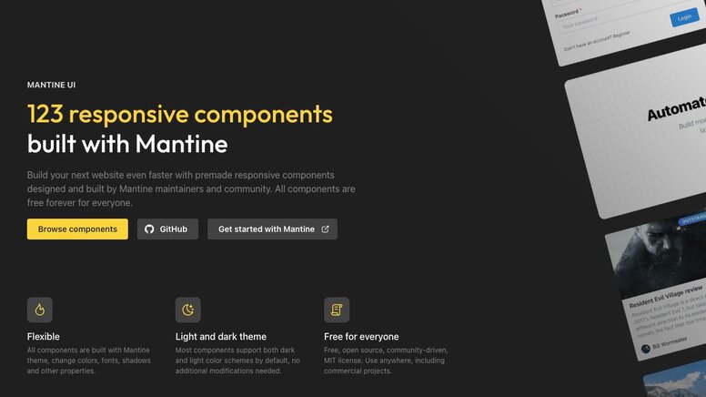
Mantine includes over 100 components plus hooks, form management, and notifications in one package. Fewer dependencies to manage and less setup time before you can start building.
The modern design aesthetic works well for most applications without customization. TypeScript support and comprehensive documentation make development smooth and predictable.
HeroUI combines beautiful design with developer-friendly APIs. Built on React Aria for accessibility, it includes smooth animations and built-in dark mode support.
The integration with Next.js works well, and the component APIs feel intuitive. A good choice when you need something that looks polished from day one.
PrimeReact offers one of the largest component collections available, including data tables, charts, and specialized business components. You can build complex, data-heavy applications without hunting for additional libraries.
The extensive feature set comes with premium themes and templates available through their marketplace. A comprehensive solution for enterprise applications.
React-Admin is a framework for building admin interfaces on top of REST or GraphQL APIs. It comes with built-in CRUD operations, authentication, authorization, and data management patterns.
The data provider architecture connects to any backend, while the component library handles common admin interface patterns. It dramatically reduces the time needed to build functional admin panels.
Some libraries solve specific problems or serve particular niches. They might offer compatibility with existing systems or excel in unique design philosophies.
React Bootstrap replaces Bootstrap's jQuery dependency with pure React components. You can use familiar Bootstrap classes and grid systems in React applications without JavaScript conflicts.
Good for migrating existing Bootstrap projects to React or for teams already comfortable with Bootstrap's design patterns.
Semantic UI React uses human-friendly HTML with component APIs that read like natural language. The code is intuitive and self-documenting.
Switching component libraries mid-project is painful. Teams burn weeks migrating from one library to another because they didn't evaluate fit upfront. The right choice depends on your stack, your design constraints, and how much customization you actually need.
| Factor | Why it matters | What to look for |
|---|---|---|
Bundle Size | Affects initial load time | Tree-shaking support, modular imports |
TypeScript Support | Type safety and IDE help | Full type coverage, generic props |
Theming System | Brand customization | CSS variables, design tokens, runtime theming |
Framework Compatibility | Works with your stack | SSR/RSC support, Next.js compatibility |
Accessibility | Legal compliance, UX | WCAG 2.1 AA compliance, keyboard navigation |
Check the library's GitHub activity before committing. A library with thousands of stars but no commits in six months is a liability. Look for regular releases, responsive maintainers, and an active community answering questions.
Design handoff traditionally breaks down when developers rebuild pixel-perfect Figma mockups from scratch, guessing at spacing and interaction states. Details get lost in translation, redlines pile up, and the entire team ends up frustrated.
Certain libraries bridge this gap better through official Figma kits and design token support. MUI, Chakra, and Ant Design all offer Figma component libraries that match their React implementations. When designers use these kits, the translation to code becomes more direct.
Headless libraries like Radix actually work better for teams with custom design systems. Since they impose no visual opinions, tools that generate code from designs don't fight pre-built styles. The generated code applies your exact tokens and classes without overrides.
Most AI coding tools generate generic HTML/CSS or React/Tailwind code that looks nothing like your actual application. They don't understand that your production app uses specific React components with particular APIs and styling patterns. You get a prototype, but developers still rebuild everything using your actual component library.
Builder.io Fusion connects directly to your codebase and works with any library listed here, whether that's MUI, Chakra, Radix, or custom components. Instead of generic markup, Fusion outputs code that uses your actual imports and follows your existing patterns.
Fusion handles:
- Component generation: Create new components that match your design system constraints, spacing tokens, and variant patterns
- Storybook stories: Automatically generate stories for your components with proper props and states documented
- Design system maintenance: Keep your Figma designs and code components in sync as your system evolves
- Visual editing: Designers and PMs compose UIs using your actual React components, not placeholder elements
- Clean code output: Generated code uses your imports and patterns, not markup that needs rewriting
If your team is tired of rebuilding Figma designs from scratch, see how Fusion plugs directly into your repo.
Yes, but it's generally not recommended. Multiple libraries can create bundle size bloat, conflicting styles, and inconsistent user experiences. If you need specific components from different libraries, consider using unstyled libraries or copying individual components rather than installing entire libraries.
Start by auditing your current component usage to understand the scope of changes needed. Create a migration plan that tackles one component type at a time, beginning with the most commonly used components. Use TypeScript to catch breaking changes and maintain a style guide to ensure visual consistency during the transition.
Most modern React component libraries support Next.js and SSR, but you should verify compatibility before choosing. Look for libraries that explicitly mention SSR support and provide Next.js examples in their documentation. Some libraries require additional configuration for proper SSR functionality.
Building a custom component library requires significant time and expertise in accessibility, testing, and maintenance. Use an existing library unless you have specific requirements that no existing solution meets, a dedicated team to maintain it, and the resources for long-term support. Most teams are better served by customizing an existing library.
Headless libraries like Radix UI and Headless UI offer the most customization since they provide no styles at all.
Builder.io visually edits code, uses your design system, and sends pull requests.
Builder.io visually edits code, uses your design system, and sends pull requests.


 Connect a Repo


