Did you know you can leverage almost the entirety of the React ecosystem inside a Qwik application?
Basically, you can build React applications, without ever loading React in the user's browser. Sounds good, doesn't it? Let’s see how this works.
You can download the code in this blog post on GitHub.
First, we need a new Qwik app. To create and bootstrap an app, we can run this command — I chose pnpm as my package manager, but you can do the same command with npm:
pnpm create qwik@latestFollow the CLI (command line interface) prompts. When you finish, it should look something like this:
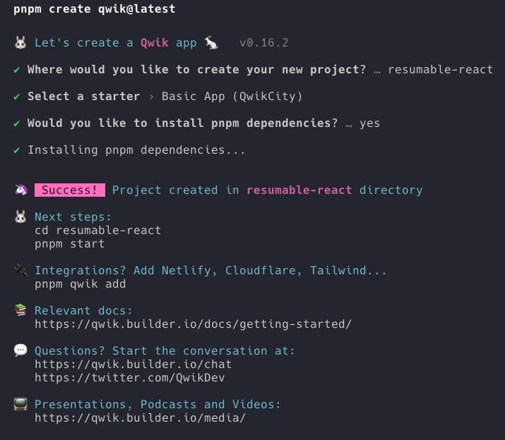
Next, we need to add qwik-react so we can wrap our React components with the qwikify$() method:
pnpm run qwik add reactThis will once again give us a CLI output that looks like this:
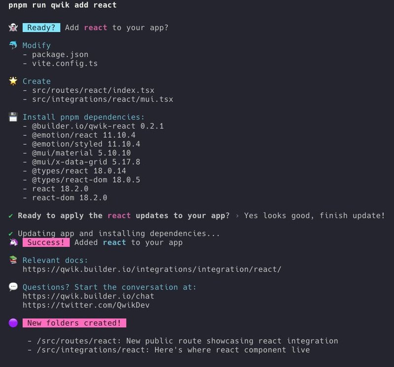
The above image shows that this has installed:
@builder.io/qwik-react 0.2.1@emotion/react 11.10.4@emotion/styled 11.10.4@mui/material 5.10.10@mui/x-data-grid 5.17.8@types/react 18.0.14@types/react-dom 18.0.5react 18.2.0react-dom 18.2.0
Most of these packages help showcase Material UI working within Qwik, which needs emotion as a dependency. The real substance is in qwik-react and the react and react-dom dependencies.
Let’s run our app in development mode:
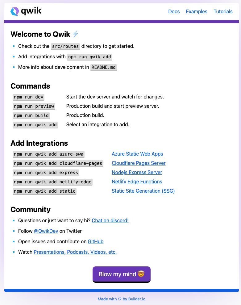
pnpm run devNow, if we go to http://localhost:5173/ the initial page renders:
For the generated UI, we can go to http://localhost:5173/react to display some React Material UI components inside our Qwik app:
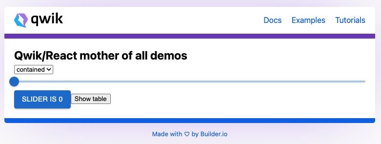
And if we interact with the components, they all work:
Let’s open up src/integrations/react and check out what the CLI generated:
/** @jsxImportSource react */

import { qwikify$ } from '@builder.io/qwik-react';
import { Button, Slider } from '@mui/material';
import { DataGrid, GridColDef, GridValueGetterParams } from '@mui/x-data-grid';

export const MUIButton = qwikify$(Button);
export const MUISlider = qwikify$(Slider, { eagerness: 'hover' });

export const TableApp = qwikify$(() => {
  const columns: GridColDef[] = [
    { field: 'id', headerName: 'ID', width: 70 },
    { field: 'firstName', headerName: 'First name', width: 130 },
    { field: 'lastName', headerName: 'Last name', width: 130 },
    {
      field: 'age',
      headerName: 'Age',
      type: 'number',
      width: 90,
    },
    {
      field: 'fullName',
      headerName: 'Full name',
      description: 'This column has a value getter and is not sortable.',
      sortable: false,
      width: 160,
      valueGetter: (params: GridValueGetterParams) =>
        `${params.row.firstName || ''} ${params.row.lastName || ''}`,
    },
  ];

  const rows = [
    { id: 1, lastName: 'Snow', firstName: 'Jon', age: 35 },
    // more rows with same object shape ,removed for brevity.
  ];

  return (
    <>
      <h1>Hello from React</h1>

      <div style={{ height: 400, width: '100%' }}>
        <DataGrid
          rows={rows}
          columns={columns}
          pageSize={5}
          rowsPerPageOptions={[5]}
          checkboxSelection
          disableSelectionOnClick
        />
      </div>
    </>
  );
});
There are a few things to notice here.
The first is /** @jsxImportSource react */ at the top of the file; this instructs the Qwik compiler to use React to produce the JSX.
The second thing is how React components are qwikified:
import { qwikify$ } from '@builder.io/qwik-react';
import { Button, Slider } from '@mui/material';

export const MUIButton = qwikify$(Button);
export const MUISlider = qwikify$(Slider, { eagerness: 'hover' });
The MUIButton is declared as a wrapper for Button from inside the @mui/material package and is exported and ready to use within a Qwik app.
It is important to note that a component wrapped this way is not interactive by default and renders only the markup.
MUISlider has a second argument passed with the { eagerness: 'hover'} option.
This is how we trigger the React hydration step, which makes the component interactive.
There are several ways we can define when hydration is triggered.
The QwikifyOptions are undocumented at the moment of writing, as Qwik is still in beta and the docs are still being worked on. You can find the definitions inside the source code.
For the eagerness property we can pass in one of the following options:
load: triggered once the document loads. Good for UI elements that need to be as interactive as soon as possible.visible: hydrate once the component is in the viewport. Good for low-priority UI elements that might be further down the page; that is, below the fold.idle: the component hydrates when the browser becomes idle after every important task has been completed.hover: trigger hydration when the mouse hovers over the element.
Similar to Astro’s client directives, Qwik has the client: JSX property. They are the same as the aforementioned strategies but you can put them on the component’s markup:
export default component$(() => {
  return (
    <>
      <MUISlider client:load></MUISlider>
      <MUISlider client:visible></MUISlider>
      <MUISlider client:idle></MUISlider>
      <MUISlider client:hover></MUISlider>
    </>
  );
});
However, there are three more strategies:
client:signalclient:eventclient-only
Let's look at each.
client:signal, based on Qwik’s reactive hook useSignal(), allows hydration whenever a signal’s value becomes true:
export default component$(() => {
  const shouldHydrate = useSignal(false);
  return (
    <>
      <button onClick$={() => (shouldHydrate.value = true)}>Hydrate Slider when click</button>

      <MUISlider client:signal={shouldHydrate}></MUISlider>
    </>
  );
});
client:event triggers when specific DOM events are dispatched:
export default component$(() => {
	const count = useSignal(0);
  return (
    <>
      <p>This slider will only run hydration after a click on it</p>
      <MUIEventSlider
        client:event="click"
        value={count.value}
        onChange$={(_, value) => {
          count.value = value as number;
        }}
      />
    </>
  );
});client:only: will not run server-side render, only on the browser.
Now that we know the options, let’s see how we can load a React component without actually loading the code.
For this, we’ll create a new route in our application and add the MUIButton component:
// src/routes/no-react/index.tsx

import { component$ } from '@builder.io/qwik';
import { MUIButton } from '~/integrations/react/mui';

export default component$(() => {
  return (
    <div>
      <h2>React component with no React code</h2>
      <MUIButton variant="contained">I'm a button from react</MUIButton>
    </div>
  );
});
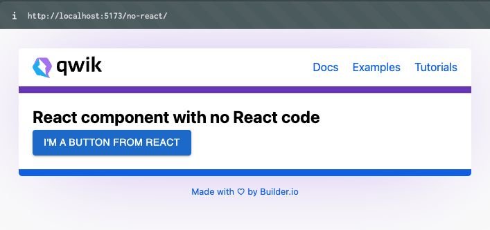
If we now navigate to our newly created route we can see that everything renders correctly:
What we’ve done in the above example is nice, but we would like the button to actually do something. We want an event listener but without React’s synthetic events.
At first, I thought that this would work:
import { component$, useSignal } from '@builder.io/qwik';
import { MUIButton } from '~/integrations/react/mui';

export default component$(() => {
  const count = useSignal(0);
  return (
    <div>
      <h2>React component with Qwik sigal</h2> // ❌
      <MUIButton
        variant="contained"
        onClick$={() => {
          count.value++;
        }}
      >
        I'm a button from react
      </MUIButton>
      <p>current count is: {count.value}</p>
    </div>
  );
});
My reasoning behind this was that using useSignal() would give me the reactivity I needed, and then an onClick$ on the MUIButton would be enough.
However, there’s a good reason this doesn’t work, as Manu (Qwik core maintainer) explained to me:
Passing an onClick this way will pass down the callback method into React, and then it’s up to it to execute it (with its synthetic event system).It’s not actually a DOM event listener as I thought it would be.
So, to get this to work we could add one of the client directives, like client:visble. Then we’d have:
import { component$, useSignal } from '@builder.io/qwik';
import { MUIButton } from '~/integrations/react/mui';

export default component$(() => {
  const count = useSignal(0);
  return (
    <div>
      <h2>Visibly hydrated React component</h2>
      <MUIButton
        client:visible
        variant="contained"
        onClick$={() => {
          count.value++;
        }}
      >
        I'm a button from react
      </MUIButton>
      <p>current count is: {count.value}</p>
    </div>
  );
});
This works. However, notice from the video below, React is loaded, as my React DevTools on the right show:
In order to get the result we want, we need to use the host: attribute, which allows us to listen to DOM events without hydration.
Let’s refactor a bit and see what this looks like:
import { component$, useSignal } from '@builder.io/qwik';
import { MUIButton } from '~/integrations/react/mui';

export default component$(() => {
  const count = useSignal(0);
  return (
    <div>
      <h2>React component with no React code</h2>
      <MUIButton
        // we removed the hydration directive
        variant="contained"
        // and just added "host:" in front of our onClick$
        host:onClick$={() => {
          count.value++;
        }}
      >
        I'm a button from react
      </MUIButton>
      <p>current count is: {count.value}</p>
    </div>
  );
});
Now it works without React! 🎉🎉🎉
We can infer this since our dev tools are not showing the React DevTools extension as they did before:
One last thing to notice is that now we do not get that nice Material UI ripple effect because it needs to be triggered internally by React code.
But we did get a React component that is pure HTML with reactivity from Qwik signals, which is way less code.
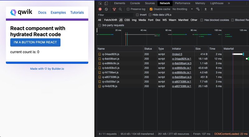
Time to look at some numbers. When I say less code, what do I mean? (This is after building and running locally on my very fast machine.)
Qwikified React component with hydration with signal: 95.6KB of JS over the network.
For fun, I built the same minimal example with a brand new vite / React project and installed the same React dependencies.
This is the React app code:
import { useState } from 'react';

import './App.css';
import { Button } from '@mui/material';

function App() {
  const [count, setCount] = useState(0);

  return (
    <div className="App">
      <div>
        <h2>Regular React component</h2>
        <Button
          variant="contained"
          onClick={() => {
            setCount(count + 1);
          }}
        >
          I'm a button from react
        </Button>
        <p>current count is: {count}</p>
      </div>
    </div>
  );
}

export default App;
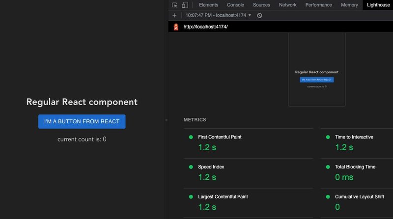
React Vite build is less JS over the network: 71.9KB of JS in one single file.
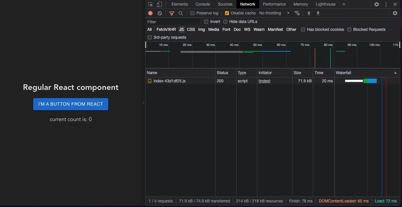
However, it seems that the React app has twice as much time-to-interactive than Qwik running React (on my machine, running lighthouse with a new Arc browser space with no extensions).
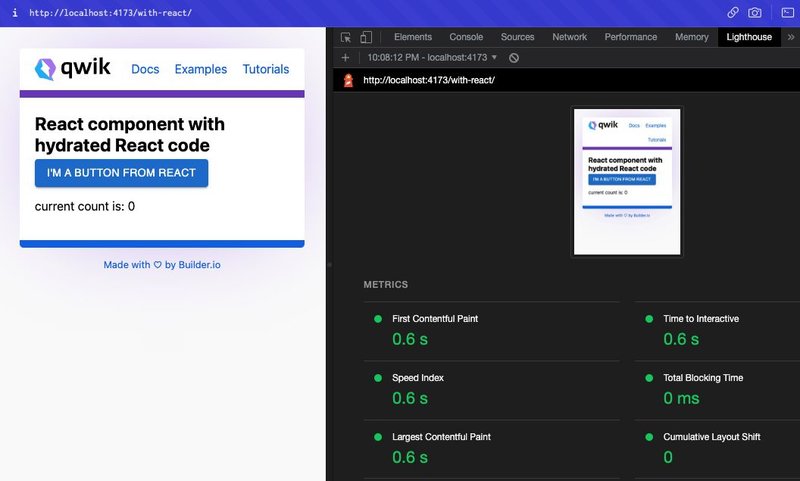
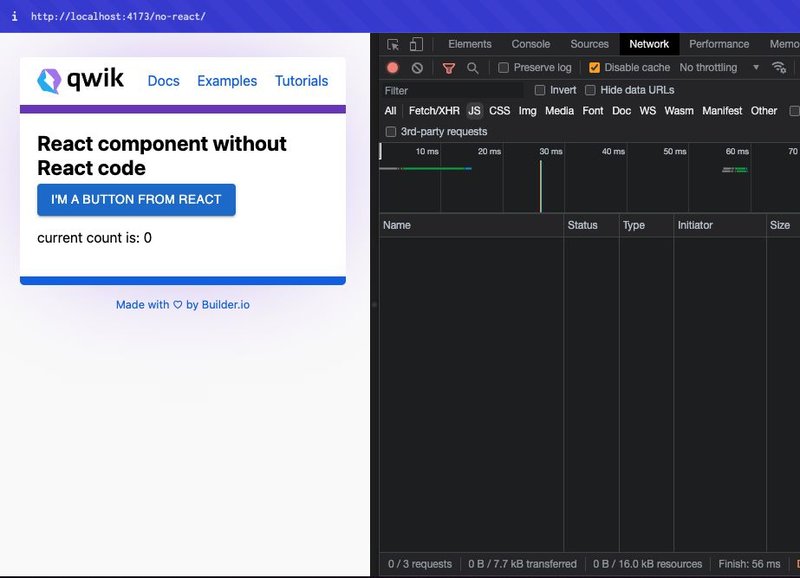
Qwikified React component with no react code: 7.7KB
At the time of this writing, Qwik is still in beta. So, as APIs are still changing and docs are still being polished there is still some work to be done.
Some things to keep in mind:
- Every Qwikified React component is isolated — it’s a fully isolated app. It's an island similar to Astro Islands. However, here they hydrate independently.
- Things can get duplicated, like styles.
- You cannot inherit React context
- Interactivity is disabled by default.
Known issues:
- When playing around with new routes that use
qwik-react, you need to restart the server.
In this post:
- We went over how to load React code inside of a Qwik application.
- We learned how to make it interactive via the different hydration strategies available.
- We learned how to make React resumable by loading the React component as HTML and allowing Qwik to handle interactions.
Having the option not to duplicate what you might have done in the past and have the ability to port it to a different foundation is exciting.
I see how this method could be leveraged to migrate React SPAs to Instant Reactive Qwik apps in the future.
To learn more, check out:
Tip: Visit our Qwik hub to learn more.
Builder.io visually edits code, uses your design system, and sends pull requests.
Builder.io visually edits code, uses your design system, and sends pull requests.


 Connect a Repo


